Basic HTML Version


12
scrapbook & cards today
•
spring 2013
the colour suite
colour inspiration
BY SUMMER FULLERTON
Colours, textures and shapes from images can ignite a creative spark.
Designer Summer Fullerton is here to show you how to bring them
to life on your next layout.
the essentials
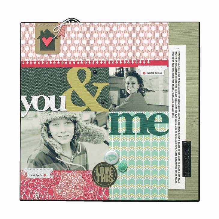
you & me
supplies
CARDSTOCK,
Bazzill Basics;
PATTERNED PAPER,
Webster’s Pages;
WASHI TAPE, GEMS,
Prima;
FLAIR BUTTON,
Studio Calico,
CHIPBOARD SHAPES, ENAMEL DOTS,
My Mind’s Eye;
PEARLS,
Bo Bunny;
TAB PUNCH,
We R Memory Keepers;
TINY ATTACHER,
Tim Holtz;
DIES,
Spellbinders;
STAMPS,
Technique
Tuesday;
TWINE,
Montana Misfits;
ADHESIVE,
Xyron
My current design obsession is colour contrast. I often find myself looking for that little something to
add a little pop to my layouts. For the Spring Colour Suite, I chose a smoky shade of charcoal grey.
When you pair up a dark, rich colour with lighter patterned papers, you’ll instantly see your project
transform from dreary and flat to refreshing and modern. To balance this contrasting colour, I chose
an assortment of light spring hues of kraft brown, coral pink, teal and chartreuse. Now it’s your turn to
embrace contrast and try this modern approach to spring colours!
Summer’s over-
sized title does
not overwhelm her
page thanks to a
well-designed,
asymmetrical grid.
Summer strategi-
cally placed three
small clusters of
embellishments on
her page, drawing
the eye to her
focal photos.
Colour inspiration is abundant on Summer’s blog:
summerfullerton.typepad.com/