Basic HTML Version

12
scrapbook & cards today
•
summer 2013
the colour suite
colour inspiration
BY SUMMER FULLERTON
Colours, textures and shapes from images can ignite a creative spark.
Designer Summer Fullerton is here to show you how to bring them
to life on your next layout.
the essentials
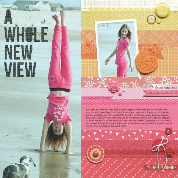
a whole new view
supplies
CARDSTOCK,
Close to My Heart;
PATTERNED PAPER,
Bella Blvd, My Mind’s Eye, BasicGrey, American
Crafts, Studio Calico, Pebbles;
DECORATIVE BRADS, ENAMEL DOTS, STICKERS, WOOD SHAPE,
My Mind’s Eye;
BUTTONS,
Close to My Heart;
CROCHET HEART,
Bella Blvd;
PUNCH,
Stampin’ Up!;
FLAIR,
American Crafts;
RESIN FLOWERS,
Jillibean Soup, Webster’s Pages;
WASHI PAPER,
We R Memory Keepers, Queen & Co.;
TINY
ATTACHER,
Tim Holtz;
DIE CUTTING MACHINE,
Silhouette;
ADHESIVE,
American Crafts
Over the past several seasons, vivid colours have been slowly making their way back into our lives, from
the fashions we buy to the shades we use to decorate our homes. One popular trend is ombre—colours
that graduate in colour and/or tone. That was my inspiration for this issue’s Colour Suite. I chose
warm, summery hues that reminded me of a sunset on the beach, and combined them with a punch of
charcoal black. Give this fun ombre technique a try yourself, using these fresh, seasonal colours
!
Summer die cut
her title directly
from a non-critical
area of her photo,
then backed the
negative space
with black washi
paper.
Using an ombre
effect is a great
way to use up
lengths of your
favourite paper
scraps!

