Basic HTML Version


18
scrapbook & cards today
•
summer 2013
paper mixology
Mix and match patterned papers like a pro
!
BY KELLY GOREE
Our resident paper mixologist is here to help you break it down,
cut it out and make it work.
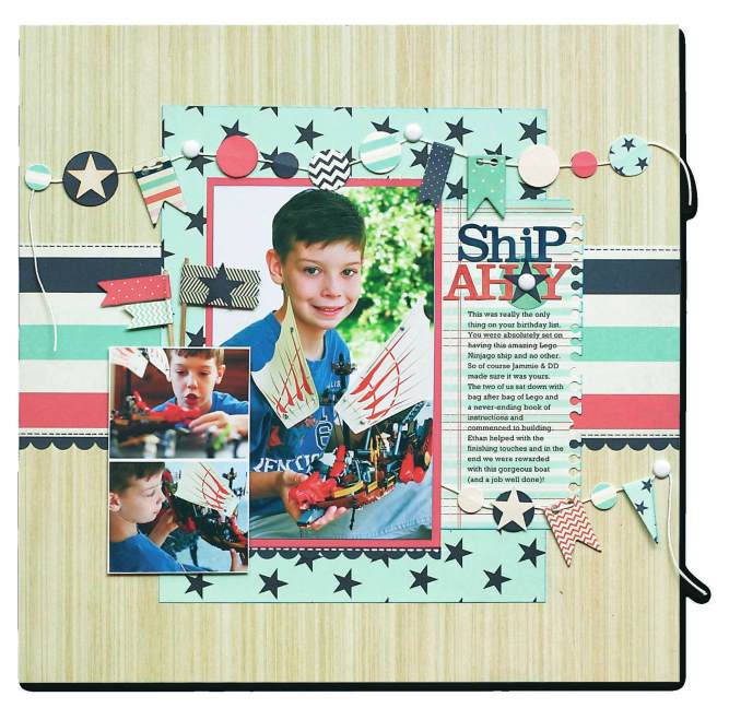
ship ahoy
supplies
CARDSTOCK,
Bazzill Basics;
PATTERNED PAPER, CHIPBOARD ELEMENTS, BAN-
NERS,
Fancy Pants;
LETTER STICKERS, BRADS,
BasicGrey;
DIE,
Spellbinders;
PEN,
Pentel;
PAPER TWINE,
Montana Misfits;
PUNCHES,
EK Success, Fiskars, Stampin’ Up!;
INK,
Clears-
nap;
ADHESIVE,
Scrapbook Adhesives by 3L
the essentials
Can’t find a wide stripe pattern in your
paper stash? No worries! Just trim 1” strips
of solid cardstock and create your own.
I’ve always joked that the easiest part of scrap-
booking is buying the supplies
!
But seriously,
who doesn’t love picking up some fresh sheets
of patterned paper from their local scrapbook
store, knowing they will be the perfect match
for their photos? Yet, when it comes down to
using those beautiful papers, you sometimes
discover that they overwhelm your precious
photos, and your photos are what the process is
all about
!
When I hit the proverbial “patterned
paper brick wall,” here are a few tips and tricks
that I try, not only to keep my photos front
and center but to enhance them, too
!
Keep your patterns to a minimum.
Use just one or, if you’re really feeling brave,
two bold patterns that compliment your
photos. All other patterns should be very small
and subtle.
Forget the dominant colour of your
photos.
Instead, choose an accent colour
from the photos and use it to guide your paper
selections—a trick that will make your photos
POP
!
Frame the focal photo.
Select a comple-
mentary solid colour to mat your photo and
set it apart. There really was a reason we used
to do this to all our photos back in the day
.
Now, it’s your turn
!
Go grab that favourite pho-
to that you’ve been afraid to put on a layout,
and make it shine with these few simple tips
!