
Welcome, everyone! It’s Mindy here for Teach Me Tuesday! I’m excited to share TWO techniques with you featuring Ink Blending and Distress Embossing Glaze. Now ink blending, I’m quite familiar with! Distress Embossing Glaze is fairly new to me, but it is a lot of fun to work with, and that’s just what we’re going to do today.
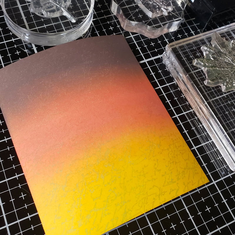
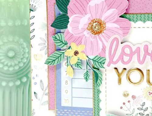
For my card pictured below, take notice of the subtle text in the background and the translucent colored embossed images over the top:
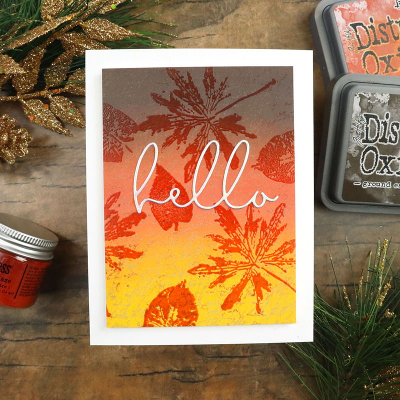
Supplies | Cardstock: Gina K Designs, Lawn Fawn; Inks: Ranger/Tim Holtz Distress Oxide Inks; Embossing Glaze: Ranger/Tim Holtz; Dies: Honey Bee Stamps; Stamps: Gina K Designs
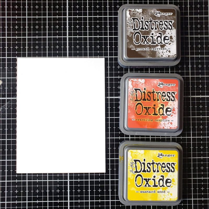
We are going to start off by ink blending with a Fall assortment of colors from the Distress Oxide collection, including Ground Espresso, Crackling Campfire, and Mustard Seed.
TIP: To get a smooth blend, start with some super-smooth cardstock. There is quite a variety out there, but my favorites include Gina K Designs Layering White cardstock or Hero Arts Dove White cardstock.
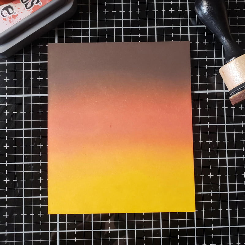
You will also get better transitions between colors when you layer the ink on. The more the ink, the better the result.
What makes Distress Embossing Glaze unique is its translucent characteristics, while still adding color to the image. What that means is you will be able to see through it. Clear embossing powder can give a similar effect, but you won’t get the color and vibrancy.
I stamped the Elegant Script background stamp from Gina K Designs onto my background using Kraft ink. I do not want this part of the background to be the focal point, which is why I used a light color of ink.
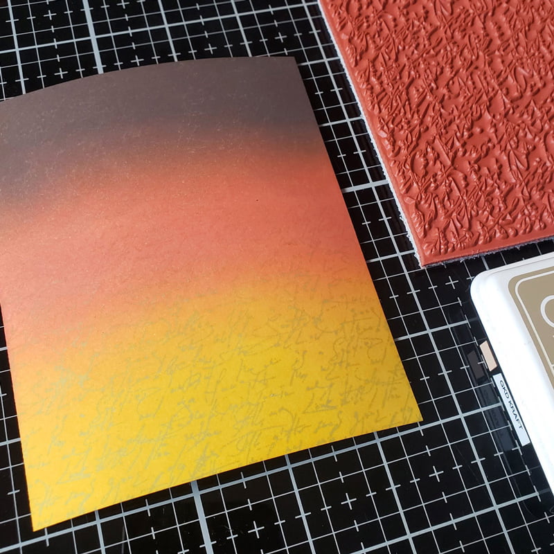
For quick stamping, I used Comfort Blocks to stamp images from the Layered Leaf Prints stamp set from Gina K Designs in Embossing Ink. A solid image works best for this technique.
When stamping a random background, I try to create a visual triangle with my images.
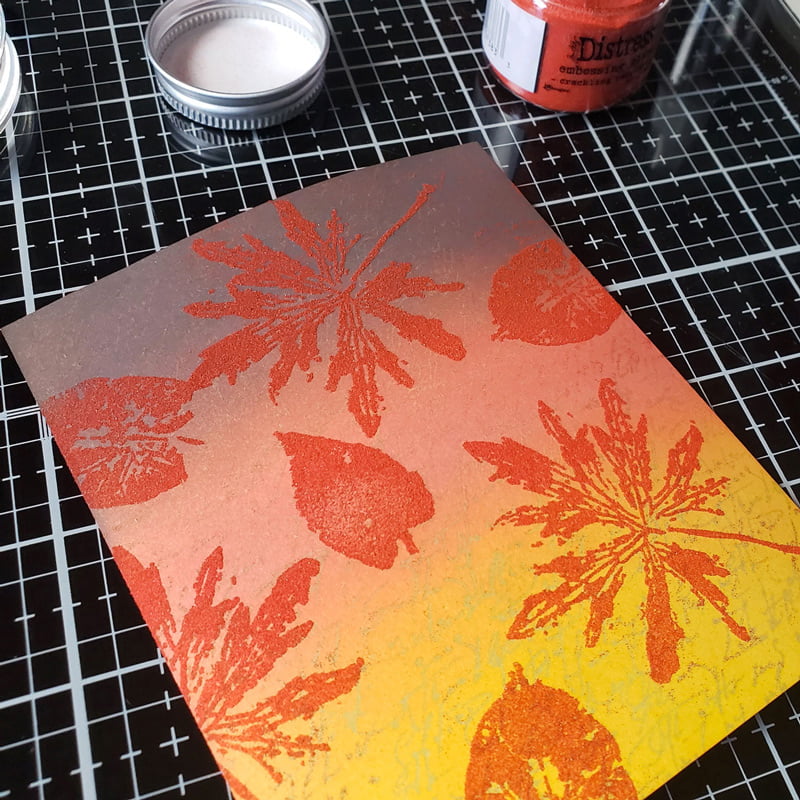
When heat embossing, it is best to have your heat gun warming up off on the side before bringing it to your paper. That way, it will melt the embossing powder quickly and minimize any warping.
TIP: Try to heat emboss your panel by holding it. By doing this, the heat can pass through the card stock and will melt quickly versus trying to emboss it on a flat surface where the hot air gets trapped behind your panel.
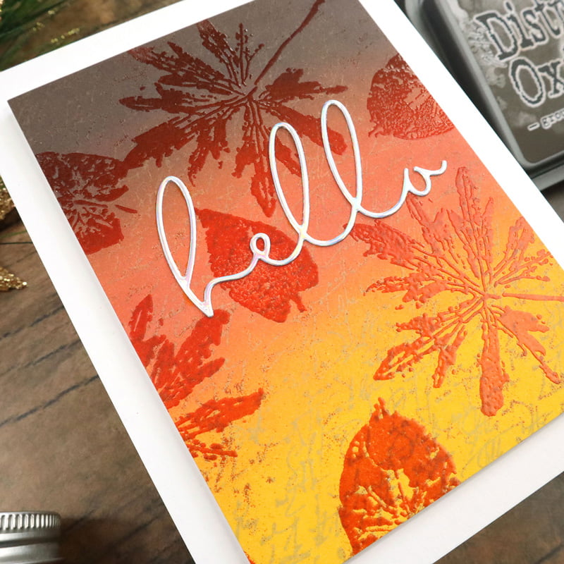
Notice in my finished piece that you can see through the embossed images to the subtle background I stamped. This adds a lot of interest to the card without confusing the eyes!
With so much going on with the background, I kept the sentiment simple by die cutting the Hello using Slimline Sentiments from Honey Bee Stamps out of Holographic cardstock.
I hope you enjoyed today’s technique and will give it a try!
~ Mindy


Thanks for sharing this quick, easy technique. I have the glazes but haven’t tried them yet. You have given me inspiration !
Gorgeous card, with a love Autumnal colour scheme. It makes me want to go and do some embossing!
Great technique! I love that embossing powders are opaque, but I guess transparency is gorgeous as well! I’ll have to pick up some of the glaze!
Great tip, I’m going to have to try this technique, gives an awesome effect!
Thanks for sharing your tip! Great card too!!!
I can honestly say, I’ve never used this glaze .I can also say i like it very much.Thank you.
Love this. I’ve never tried this technique.
Beautiful card. I love the subtle text in the background and the beautiful effect that you achieved with the embossing glaze. I love the glaze. It’s so much fun to play with. Thanks for sharing your process and tips.
Very cool! First time seeing that embossing glaze in action. Love that background stamp by GKD. And your ink blending is gorgeous as always Mindy. :)
Love this! Thanks for the tips.
This is beautiful! I love the layered script, colors and embossed images. What a stunning fall card!
Thanks for the tips! I never knew it would be better to apply the heat gun while holding the card instead of it lying flat.