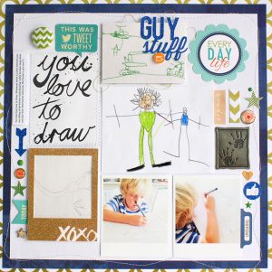
Welcome to the March Colour Suite. This month my colour starting point was gold. I confess it’s kind of a secret obsession of mine. In scrapbooking I know we often associate gold with weddings or the holidays but I thought by pairing this fun accent colour with some blues and greens we take on spring with a bang.

I used the main colours of blue and green to create my layout base and then embellished with white and gold. While I confessed to my gold obsession I knew it was going to be the focus accent element on my layout. While my stash produced lots of gold sequins and stars I gravitated to the gold embossing powder to create customized colour coordinated elements to coordinate with my colour suite. I also played around with something new, a tone on tone title effect. A die cut title and circle were cut from the same white cardstock the end result is subtle.

This month I invited the wonderfully talented designer Kim Jeffress to join me and take the Colour Suite challenge. I cannot say this enough, the Colour Suite is all about interpretation and there is never a right or wrong way to use colour. Kim told me she loved the mixture of the soft pastels with the bright bold green and gold. She confessed she thought she used too much white. No way I love how visually different her layout is from mine. We both started with the same colour inspiration but the end results are uniquely their own and this is the beauty behind colour.
So my friends this month’s lesson is let your unique voice shine through your use of colour. I promise you the end result will be magical (especially when you add a little sparkle!) Be sure to check out our past Colour Suite challenges which are all archived here!
Happy Scrapping!
~ Summer Fullerton

