Regardless of what art form you practice—be it interior design, photography, any form of visual art, quilting, graphic art, or, as it relates to this article, paper crafting, one of the most important elements or “rules” of composition and design is the rule of odds.
According to Wikipedia, “by framing the object of interest in a piece of artwork with an even number of surrounding objects, it becomes more comforting to the eye, thus creating a feeling of ease and pleasure.” In simpler terms, it basically means that humans identify (and therefore feel closer to) pieces of artwork that contain “groupings” of elements—we subconsciously see the center of the grouping (i.e. the focal point) as ourselves, and see the surrounding elements as comforting “friends.” Make sense? If so, we can conclude that the eye favours compositions that utilize odd numbered groupings of design elements—1’s, 3’s, or 5’s. As paper crafters, we can see just how easy it is to incorporate this principle into our projects. Here are a few of our favourite ways:

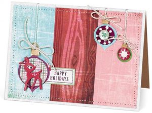
happy holidays by Kim Hughes
For this sweet card, Kim split the background into thirds—keeping the more neutral patterns to the outside, and keeping the busier pattern in the middle. Thus, balance is achieved. She also created a grouping of three ornaments—the largest one is the clear focal point, but two others are placed successfully to keep the first company. Varying the size of the ornaments (small, medium, and large) also worked to create a visually pleasing card.

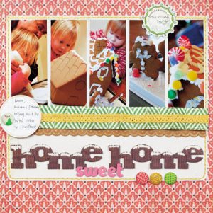
home sweet home by Kimber McGray
On this beautiful layout, Kimber incorporated the rule of odds in several places. First, she created a horizontal grid containing five photos. Second, she used three fabric brads along the stitched border. Third, Kimber layered a scalloped border, an accordion-folded border, and a ribbon border (i.e. a group of three) to successfully draw the eye from left to right. Fourth, she implemented a three-word title—putting emphasis on “sweet” by both its placement in the middle and by her choice of a different colour, size, and texture. Finally, she created a visual triangle between the two separate journaling tags and the grouping of brads.

snow boy by Allison Cope
Allison incorporated the rule of odds in a variety of ways. Check out the way she used a journaling block to mimic a third photo. Allison cut three same-sized circles from different papers and placed them on her layout in the shape of a triangle—this helps lead the eye around the page. She also created odd-numbered groupings of die-cut and punched snowflakes and added three smaller circles underneath the journaling block to give weight to the bottom of the page.
What great projects, and what inspiring ways to incorporate this design principle! Thanks for sharing, girls! I do have a question, though. Does it mean that even numbers of elements on our layouts or cards are ALWAYS taboo? Not at all! There are many instances where they both enhance and enrich our designs, however, as a general rule of thumb; odd numbered elements are more pleasing to the eye. Being the “odd man out” doesn’t sound quite so bad anymore, does it?

