
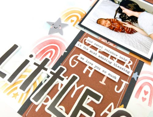
Single-photo layouts aren’t a go-to design for me, as I usually have lots of photos from an event that I want to include on a layout. And honestly, I always struggle to fill the space on a solo photo arrangement! But for this layout, I only had one photo capturing the event – my daughter’s first score in a basketball game – so I needed to work with the single photo composition.
I typically don’t use photo enlargements, as I prefer to work with photos 4×6 or smaller, but I printed this photo at 5×7 so it would occupy a large amount of space on the page. Then I used bold elements (bright colors, an oversized title, and lots of star shapes!) to help divide the page and create focal points. The orange and white background papers help break up the page visually and the lighter bottom half gives me a nice spot to position a block of journaling.
For my title,I used large die-cut numbers in bright aqua and positioned it to balance the photo. While it’s not quite the same size as the photo, the color gives it visual weight. To connect the title and photo block, I used a diagonal border of various star shapes (chipboard, punches and enamels). This border leads the eye through the design and forms a connections between each element.
So the next time you’re stuck on a single-page design, try these tips. Print your photo larger than 4×6 and use lots of bold elements to help fill the canvas. They’ll make creating an interesting and balanced page a snap!

Love your colour choices! What collection is this? It’s really pretty. Great layout Lisa.
Wow. What a great layout. I really love it. Thanks for the awesome inspiration!!
Great LO ?
Beautiful layout!! Thanks for sharing!!
-Berina
Moxie Craftie
Fabulous layout!
Lisa, single photo layouts may not be your forté, but they could be, this layout is wonderful!
love the easy on the eye color scheme, fresh and perfect!
Love the colours and pointers, thanks.
Pretty powerful using the large items….very nice LO Lisa
Great idea for using the two background papers! They really make the photo stand out!!! TFS!
such a beautiful layout!
Thanks for sharing this great tip