

Hello friends! It’s Latisha Yoast here to share some fun cardmaking design tips. For a lot of cardmakers, thinking and executing the design of a card is a struggle. Today we’re focusing on center-weighted cards, and the designs I am sharing today use the general sketch of Mindy Eggen’s card from the SCT Magazine Summer Issue on page 39. I used stamps, dies and cardstock from Concord & 9th on all three cards.

What is a center-weighted card? Great question! Let me answer that question before we begin. A center-weighted card is one where the center of the card holds the weight and focal point of the design. Very few elements will draw your attention outside of the center of the design. This is probably the most common design for cards, because it always works. This design is just about fail proof. When there is doubt, a center-weighted card is the answer! Take a look at the cards I created:

Supplies | Cardstock: Concord & 9th; Ink: Concord & 9th Ballet Pink, Poppy, Cranberry; Stamps: Concord & 9th Festive Phrases; Dies: Concord & 9th Festive Phrases, Bough & Holly; Adhesive: Scrapbook Adhesives by 3L foam squares; Patterned Paper: Concord & 9th Be Merry; Stencil: Concord & 9th Boughs & Holly Stencil Pack

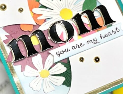
Hopefully your eyes went directly to the “merry” in the center of this card first. The red cardstock frames the sentiment and greenery perfectly, so that the eyes stay in that area. The vellum is really the secret star of this show! It allows just a muted touch of the patterned paper to peek through.

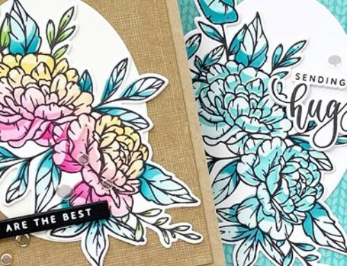
After I created the card base and the patterned paper was adhered, the top panel almost looks like it’s two more layers. I created a ¼ inch border around the edges of the paper with removable tape before using Ballet Pink, Poppy & Cranberry inks from Concord & 9th to create this blend. After removing the tape, I stamped the sentiment in black. This is another example of what a center-weighted card looks like. Why does this work? The ink blended panel not only has a white border, but a bigger patterned paper border, which draws your attention to the blended panel and the sentiment.

For this card, the center panel is an ink blended wreath with a die cut sentiment in the center. Your eyes immediately go to the sentiment and the wreath before noticing the rest of the card. This is a perfect example of how a center-weighted card design works!
All three of the card examples shown today are center-weighted cards that also have a visual triangle within them. Placement is the key element of these designs. Once you start creating more center-weight cards, it will become easier to see how using placement to create a visual triangle works within that design.
Looking for more center-weighted card examples? Head back to the Summer 2022 issue of Scrapbook & Cards Today Magazine and see page 32 by Jean Doeringsfeld, page 35 by Lea Lawson, page 51 by myself, page 53 by Mindy Eggen, and page 66 by Breann Loveland, and if you decide to create a center-weighted card design, tag us on social media @sctmagazine and use the hashtag #sctmagazine!


Beautiful cards!
Really beautiful cards, I did not know this tip. Thank you.
Just perfect placement and loved your beautiful cards!
The wreath card is my fave! But they are all darling.
Very interesting! My eyes DID go to the sentiments first and having the explanation helps me to realize that this really does work! Great cards! Tvmfs ????