

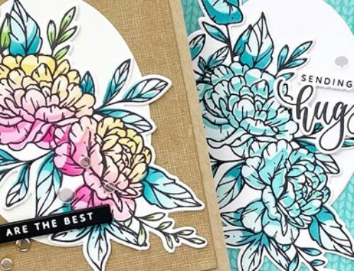
Hi there! It’s Daniel West, from Del & Artie here with video inspiration for Father’s Day. In this post and process video, I am featuring the simplest Copic coloring technique ever and Colorado Craft Company’s Anita Jeram stamps, along with tips to help you get crafting your Father’s Day cards!
Supplies | Colorado Craft Company Anita Jeram ~ Recharge, Colorado Craft Company Anita Jeram ~ Dad’s Cooking, Picket Fence Studios Black Hybrid Ink Pad, Copic Markers E42, E13, W6, W4, B91, B95, YG67, YG63, 3M Foam Tape, X-Press It Card, Accent White Cardstock, Tim Holtz Guillotine Trimmer
I get a ton of interest when I talk about masculine cards or Father’s Day designs. Many crafters feel like their designs may lean too much to the soft and frilly side to give them to a man. So I have some quick tips on making Dad a card.
Tip #1: Remember who will receive your card
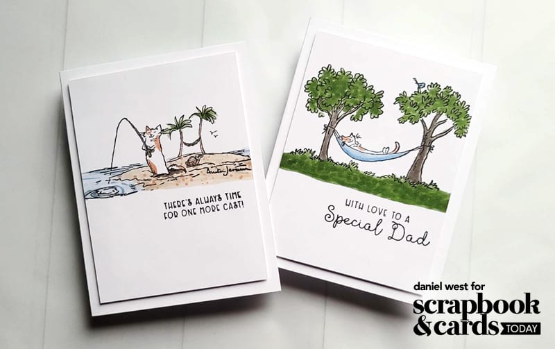
As always, we keep our recipient in mind. But for a Father’s Day card, we want to connect with our fondest memories or our father’s favorite things. In my fishing card, I took a trip back to the best of my times with Dad, with a rod and reel and plenty of time to spend together. That was my dad’s FAVORITE thing ever—fishing.

Tip #2: Put away your sequins and glitter
Just for Fathers’ Day, my friend, for the love of Pete, don’t pull out your sequins or glitter! Dads tend to be less frilly and more rugged. Or at least we like to think we are. So save your bling for your besties and give dad a card that shines in a different way.

Tip #3: Limit your colors
Limiting your color palette makes for a more sophisticated card. But limiting the palette to more desaturated and earthy colors can give a more masculine feel. For my projects, I used 7 or 8 markers, but the palette included only three hues.
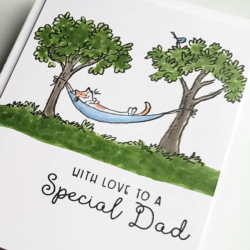
As a dad myself, I enjoy cards that keep it simple and cohesive. I also really enjoy themes like rest and reading and recreation.
Watch these two cards come together in this video:
These cards work because of their simplicity. I just stamped the images and colored them in. The only extra bit I did to step them up was trim down the colored panel and pop it up on each card base.

Tip: When coloring in a scene like these, add color from edge to edge. This gives the appearance that the design continues off the page. You’ll thank me for this one!

Tip: When using alcohol markers, use X-Press It Card for your paper. This card works wonders for blending your colors.
Thank you so much for joining me today on the Scrapbook & Cards Today blog. You can catch lots more inspiration from me at Del & Artie. I’d love to connect with you and see your Father’s Day creations on all the socials. Just tag me @delandartie when you post them!

Connect with Daniel at these links: Facebook | Instagram | YouTube


Great cards and such a neat colouring technique. Thanks for sharing.
Great tips, these cards are great.
LOVE these cards so much! As would any Father who received them I am sure! I just LOVE these stamps and dies and Daniel’s work! Amazing!
Love the cards and how simple they are, and I love that you shared your memories of your dad. Thank you.
So nice and refreshing to see and hear a man’s perspective of creating. LOVE it! :)