

Hello! It’s Meghann Andrew with you today. Summer is in full swing here, which means less time in my crafty space and more in the pool! I’m not slowing down with photo-taking, however, so how do I document the same amount of photos in less time? I create layouts with coordinating pocket pages, and I have one of these combinations to share with you today, with a beachy, summer vibe created with the Sunny Days collection from Crate Paper!
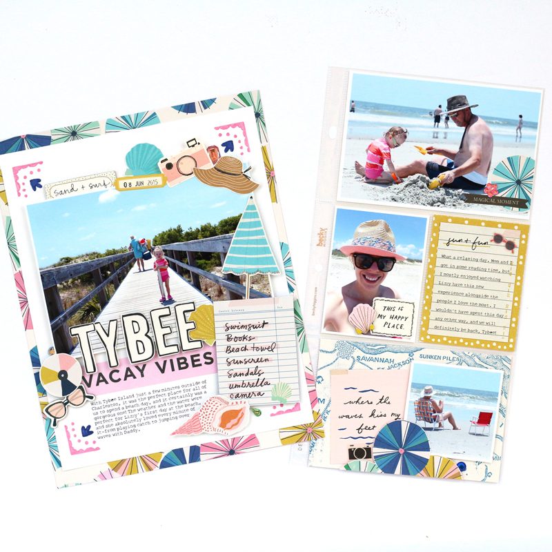
There were so many photos that I loved from this trip to the beach a few years ago—my daughter’s first beach day, but if I created a scrapbook layout for each, I’d be creating for quite a while! Instead, I selected all of my favorite photos, chose a favorite photo that started out the day to create an 8-1/2″ x 11″ layout, then printed the rest of the photos to slide into an adjoining pocket page.
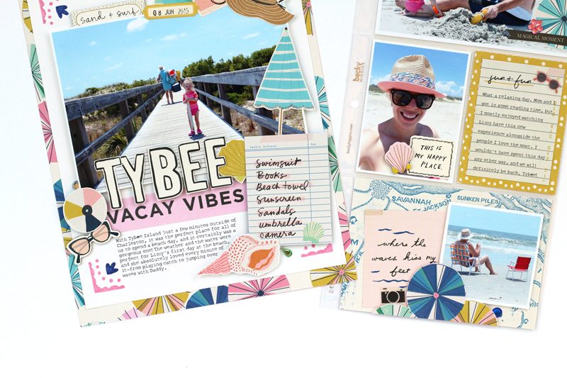
I started out with a frame of the multi-colored Parasol paper to set the color scheme for my spread, adding white cardstock in the middle for that clean, white space. This collection includes the most lovely stencils, and I used them along with my Vicki Boutin markers to add pink and navy decoration to each corner. The negative space at the base of my oversized, 5″ x 7″ boardwalk photo created the perfect opportunity to add a title below, which I fussy-cut from the word-heavy Bright Days paper and sat it on the “vacay vibes” die-cut, which created a colorful, solid shelf for my photo.
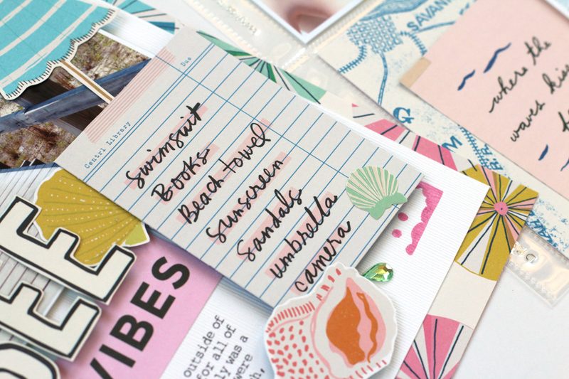
The fun part of this layout was adding a frame of fussy-cut, beachy illustrations around my photo, fussy cut from the Collected and Sun-Kissed paper, as well as the cardstock and chipboard stickers. I loved the cut-apart card from the Beach Day paper that listed all of the items that are needed for a day at the beach. Before finishing off the page, I also added some gems to the frame for a bit of sparkle.
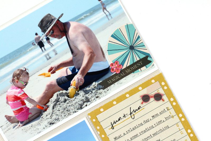
To tie my adjoining pocket page to my main layout, I carried the lovely Parasol pattern across to my pockets, but I fussy cut the colorful circles out to add them as embellishments to the negative space on my photos. When I have a supplemental pocket page next to a layout, the emphasis is more about getting extra photos and words documented than embellishing, so a few stickers, patterned papers, and die-cuts that coordinate with the layout carry the color scheme and story across.
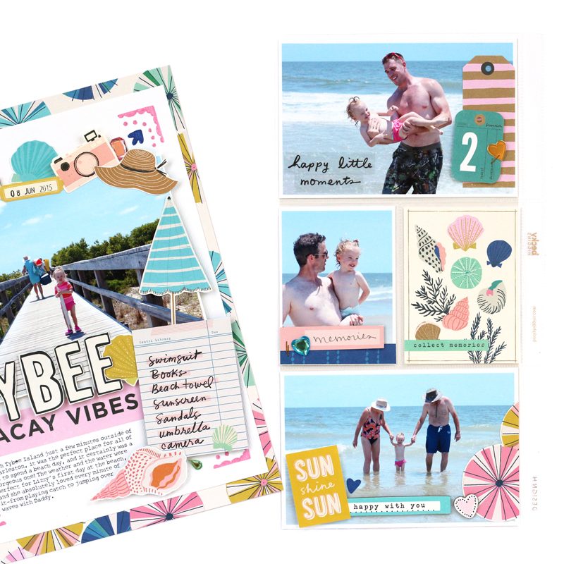
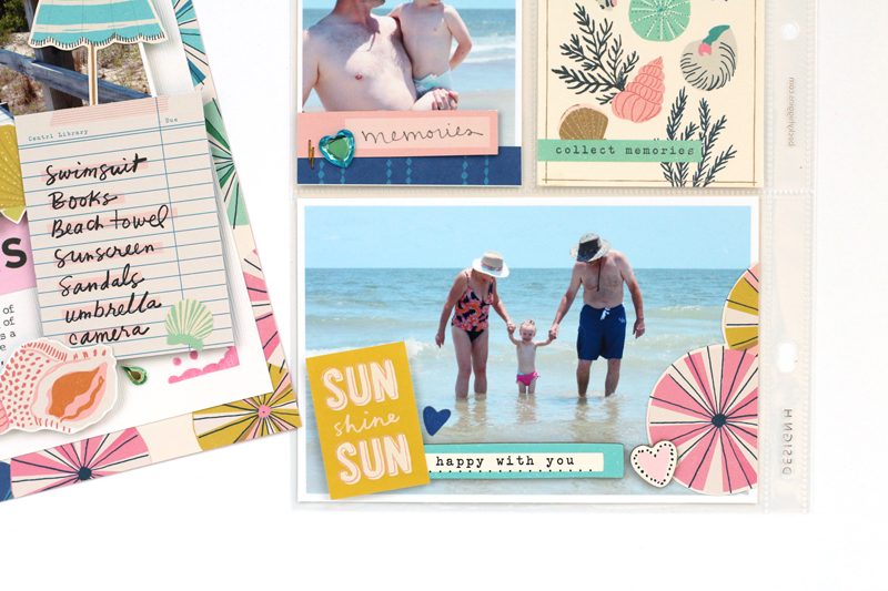
I carried the same colors and illustrations to the back of the pocket page and included some of my favorite photos from the day. I even slid the seashell card from the Sunny Days ephemera pack in without any additional embellishment. Remember that not every pocket needs to be embellished! Sometimes less is more.
I love the combination of layouts and pocket pages! Not only do I get to get more photos printed and in my album, I create in two different formats that I love, leaving me more time to work on my tan!
We’re going to be discussing combining traditional layouts and pocket pages in the SCT365 Inside the Pocket classroom in October, so I hope you’ll join us for even more tips and ideas on how to combine these awesome formats! Thanks so much for stopping by today!


I love combining layouts plus pocket pages
for the same reason you mentioned.
Darling summer layout with pocket you created and shared! ❤
Love this look of combining layout and pockets. Paper choices were perfect! Looks like a wonderful day was had by all!
Love the combined layout. Meghan, and so very much looking forward to the October pocket class. Just what I need!
I have to agree 100%! Nicely done pages too!
Love how you used the Sunny Days collection on your project!
The combination of pocket pages and layouts is something I like to do because it gives me the opportunity to do both at the same time.
I just tried doing pocket pages for the first time. It does save time and is so much fun. Your pages are beautiful and when your daughter is older, she will love it. My kids, both grown, still love the pages of them as children.
Cool projects. Thanks for the chance to win!