
Hi there! My name is Felicitas, and today I am going to share with you how I compose my pocket pages. There are many ways to create a cohesive layout design: You can focus on color, on shapes and forms or even have repetitive elements to draw attention and recognition. All of these examples will give your spread a more uniform feel and bring your photos and stories better together.

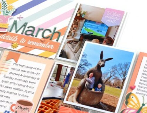
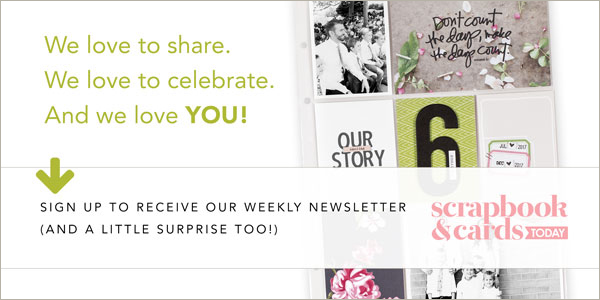
To begin my pocket page layout design, I have a look at the photos and see if there’s already a color that pops more than one time or if there’s any color highlighted in the photos that I can build up by using product. As you see on my “Weekend Stories” page, there are a lot of blue and teal hues and also some orange in my photos. I was very lucky this week because these two colors naturally go great together since they’re opposites on the color wheel or complementary colors.
Next step: Finding matching embellishments. I could have gone through my stash and looked for filler cards within this color range, but I decided to paint my own custom art pieces with my trusted Mijello Mission Gold watercolors instead. That’s always a safe bet since you can customize your own colors!

I also love decorating my cards and photos with stamps. They’re a great and versatile tool to fill empty spots and so easy to customize in color.
In this spread, I used the Studio Calico Gather Stamp Kit to repeat the same sentiments on several photos. I also used some washi tape and the small puffy hearts to create a similar cluster of elements for each of my photos. I added the rest of the stamped elements from the New Adventures set by Everyday Explorers Co.

To finish, I brought in more of my custom watercolors by adding thin strips of left-over scraps to both of my journaling cards, creating another repetitive element on my page.

And that’s it! I usually keep it pretty simple with the embellishments—mainly using stamps and adding some leftovers from my stash, but I really enjoy coming up with color palettes for my spreads. Colors are so much fun to play with: Just look for a starting point in your photos and then go wild!
One last tip: If a photo doesn’t match your color scheme at all, you can always make it “neutral” and turn it black & white!

I would love to see you create your next cohesive spread focusing on colors, shapes or repetition. If you share your projects on Instagram, tag me @felicitasmayer and @sctmagazine so that we can cheer you on!
Thanks for stopping by today!

Felicitas Mayer is a German graphic designer and modern memory keeper. For the last 6 years, Felicitas had her own stamp brand PAPIERPROJEKT with over 100+ exclusive stamp sets designed by her for memory keeping, bullet journaling, cardmaking and paper crafting in general. Felicitas and her team shared regular tutorials on how to use her products and inspired paper crafters with new techniques and project inspiration on a weekly basis.
After closing the physical stamp shop and a needed break from the industry, Felicitas is back in 2020 with plans for online education and digital product-design for documenters.
Follow Felicitas on Instagram: @felicitasmayer
Website: www.felicitasmayer.com
………………………………
Want more pocket page inspiration? Click here to learn more about our SCT 365 Inside the Pocket class! This year-long self-paced course will delve into a different topic on pocket page scrapbooking each month— from journaling, to embellishment and will help you to perfect your pockets, and record more memories in 2020! Get registered today for less than $3 per month!


Beautiful spread! I love how you created your own pocket pages with paint. Very creative! :)
aww thanks Teresa!
Beautiful pocket page layout! It’s great to see someone else handwrite their journaling. Love the teal and orange!
Thanks Janice! I feel like I don’t have the neatest handwriting, but I try to make it work ;)
How very cool & creative! Adding pockets of mixed media to pocket pages=genius! Love the way you can tailor the colors to match/complement the photos or mood!
YESSSS!!! …and thanks Kelly. I always start with colors first, so making my own cards is an easy fix when I don’t have matching filler cards in my stash.
Loved this post and my layouts will definitely benefit from the tips and ideas to make pages more cohesive and pleasing. Thank you.
Awesome, Sandra! I’m glad you find inspiration in my post!
this is gorgeous! thank for the inspiration.
You’re very welcome, I’m glad you found it helpful.
Thanks for your inspiring tips and techniques. I would never have thought to create my own mixed media backgrounds for using in my mini albums. Love what you have created, magic!
Aww thanks so much for your so positive feedback, Glenda! I’m glad you found my post inspiring for your own art!
Ver clever. Very beautiful layout
Thank you very much, Nina!