
Welcome to Friday, friends! It’s a weekend of gratitude and gathering with our families as we celebrate Canadian Thanksgiving! Before you go to prep your holiday meal, let’s get inspired by our friends at Close To My Heart, who are sharing fun ink techniques with us today, as well as a fantastic giveaway!
We’re also excited that today we finally get to tell you about our newest SCT Delivered class, Planner 101! Be sure to read all of the way to the end of the post to find out all about it!
…………………….
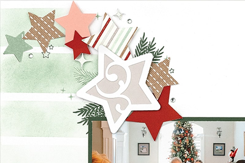
It’s Jill with Close To My Heart and I’m excited to share with you some fun techniques to try on your next scrapbook layout. If you are like me, you have quite a stash of supplies, including inks of every shade. So often, we think of our inks as stamping tools, but they are so much more! On this layout, we’ve created our own background paper with a few simple supplies.
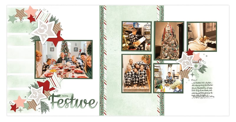
On the left page, we used masking tape and a beautiful new ink color called Seabrook to create a striped pattern on White Daisy cardstock. By applying the ink directly using a blending brush, you can create any look you want from a marbled watercolor effect, to a solid, intense line of color. The only difference is the amount of ink you apply. With this layout, we are going for a softer look and wanted the stripes on the left page to mimic the feeling of the textural patterned paper on the right page.
Using these staple supplies, you can create almost any look you want. I know I will use this technique again and again by changing up the widths of the stripes, adding a rainbow of colors, or increasing the saturation of a few monochromatic colors. I hope you’ll give it a try!
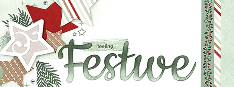
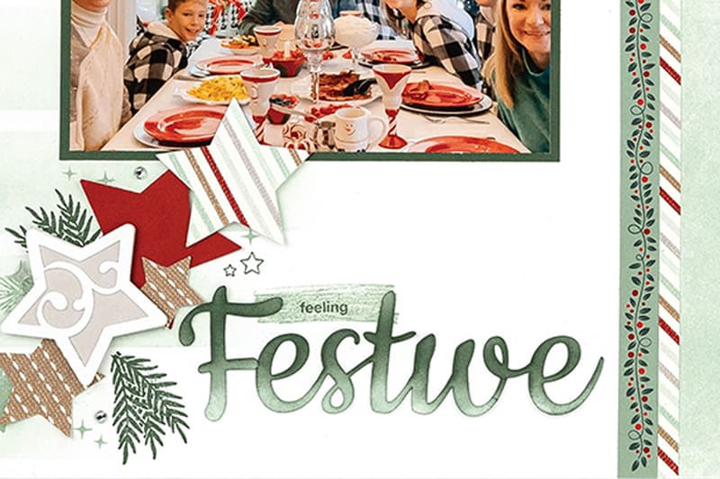
We continued with inking techniques on the title. The title is cut from White Daisy cardstock. By using another new color, Pine ink and blending brushes, we applied more ink to the top to get a darker color, creating a gradient effect on the piece which gives it more depth and dimension. You can always cut the title from solid cardstock, but I love how elevated this looks because of the varying color that results from this inking technique.
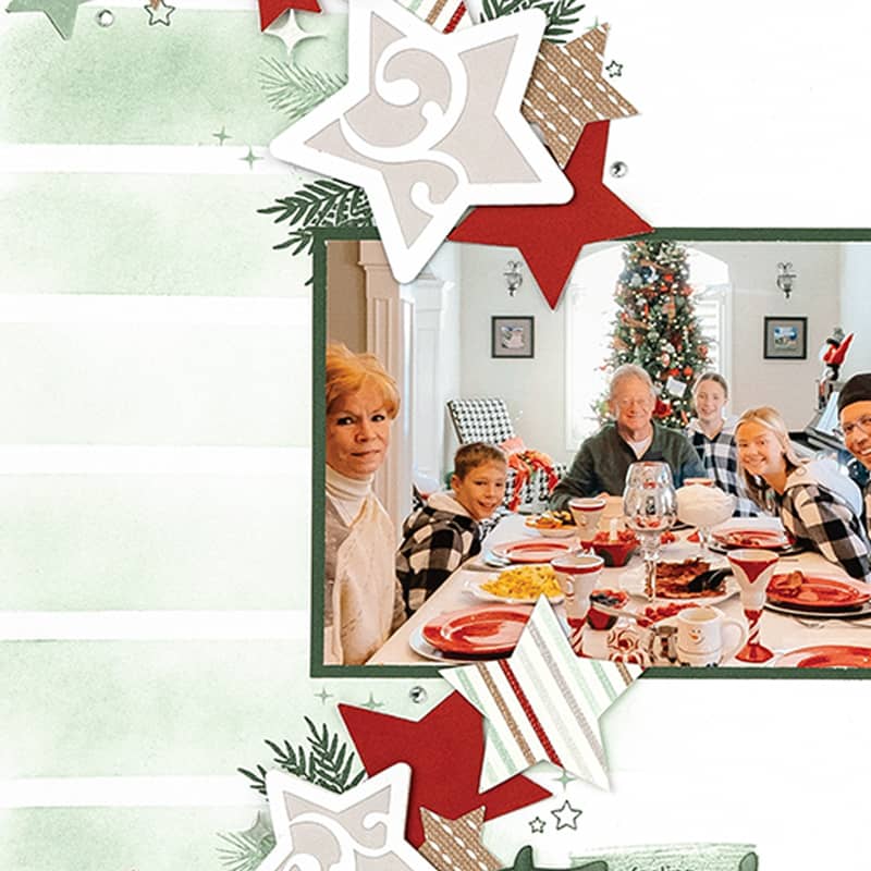
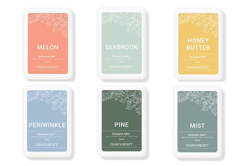
Lastly, I want to point out the fun detail happening in the stars as the finishing embellishment on the page. Using some simple cut pieces, we’ve added movement and pops of color to the page by mixing in cardstock, patterned paper, stamps, and acrylic shapes. We used the same ink colors to stamp the branches to the base pages and sprinkle in some stamped stars to really round out the layered paper stars. Close To My Heart has 40 exclusive colors and just launched six new stunning colors that we can’t get enough of!
If you love learning how to get even more from your inks and stamping supplies, you’re in luck! We are creating this exact layout, along with 10 other two-page layouts in our upcoming Close To My Heart Album Retreat! At this virtual event, you spend three days creating along with me and the other talented teachers at Close To My Heart while we share something new with each page.
Learn more about the Close to My Heart Album Retreat HERE!
One of the best things about Album Retreat is that the pages are all pre-cut for you so you can spend your creative time focused on the techniques and the educational components. You also get a great deal of full-sized product and an exclusive stamp set. This is truly our favorite event of the year because you invest in learning AND you have a finished album at the end! The theme for our November album is all holiday-specific, so you can add photos from the past or be ahead of the season for 2022 – it’s up to you! You can find all the details HERE.
We look forward to sharing even more of our favorite tips and tricks for your inks and would LOVE to see you there!
Close To My Heart wants you to experience the inking techniques for yourself, so comment here on your favorite of the new colors by midnight Eastern time on Wednesday, October 12th, and we’ll choose two lucky winners to receive a set of each of the six new Exclusive Inks colors. Be sure to follow us on Instagram, Facebook and our YouTube channel for even more creative inspiration!
…………………….
What awesome ink techniques, Jill, and such beautiful new ink colours from our friends at Close to My Heart! Now, let’s announce last week’s giveaway winner! This lucky commenter who shared their favourite part about winter will receive a Winter Tales prize package from Spellbinders:
“Being all cozy inside and enjoying some reading or crafting with a candle burning!” ~ Alexandra
Congrats, Alexandra! Please email meghann@scrapbookandcards.com to claim your prize!
…………………….
NEW CLASS NEWS!
We are so excited to be able to share this big news: our first class of 2023 opens next Friday, October 14th: Planner 101 with Jennie McGarvey! This class will get you started with paper planning whether you’re new or haven’t picked up a planner for a while. Not only will you learn the how and why to plan, but you’ll also learn about memory planning and how to add pizzazz with fun decorative additions. Jennie will share her knowledge and expertise about how to keep your planner functional and creative all at once! By the end of the year, you’ll have lots of new ideas for staying on track beautifully. Take a look at this to learn more:
This class will include monthly lessons beginning on November 25, 2022 to get you set up for the new year, and end in November 2023. We hope to see you there!
Click HERE more about Planner 101 and get ready to register on October 14th!
Close to my Heart always has such beautiful ink colors! I love both the periwinkle and the pine. Great ideas to use them to pizzaz up a piece of white cardstock! thanks for sharing!
The Honey Butter looks yummy!
Beautiful ink colors. I seem to be drawn to blues, so the Mist and Seabrook catch my eye.
love these colors – the periwinkle is my favorite:)
I really love the new Harbour ink colour, all the colours are beautiful additions for CTMH.
Such beautiful inks. Loving the Seabrook. What a stunning layout. Those stripes are so effective. Thank you for the inspiration.
I just tried Close to My Heart inks for the first time at a crop a few weeks ago and fell in love. They blend so easily and look so beautiful! What an awesome giveaway! Pine is my favorite color!
My favourite colour is Periwinkle. Thanks for the opportunity to win.
Mist is my favorite new color. It reminds me of a peaceful and relaxing place. Can’t wait to use it on my pages!
My favourite new colour has got to be Honey Butter. It’s such a warm and cozy shade.
What a lovely layout! My fav new ink colour is honey butter.
I love all of the new colors but the Melon is my favorite!!! Thanks for the chance to win these beautiful stamp pads.
Mist would be first as it is so different from what I have. All are so pretty it would be hard to only have one.
I love all these colours! Periwinkle caught my eye first. Then Honey Butter and Pine and Melon and Mist followed by Seabrook. They would all play nicely together!
They are all beautiful colors! My favorite is Melon. Thanks for a chance to win. And Happy Thanksgiving to all in Canada :)
My favorite of the new inks is Periwinkle. It’s unusual and so pretty.
Periwinkle is one of my all time favorite colors!
Wonderful colors! My favorite color is periwinkle.
The Seabrook and Mist are my favorites!
These are beautiful ink colors! Honeybutter and Seabrook are my favorites!
Love the pine color, it’s almost a warm hue.
Festive pages. Favorite ink color is Honey Butter.
Wow, they are all lovely! If I have to pick, I’d say the Honey Butter. It looks like it would be perfect for sunflowers!
Love the Pine. Will be so useful for Christmas
cards. Perriwinkle is a shade of blue (my
fave color) and I think it’s great too. thanks
for offering a great gift. txmlhl(at)yahoo(dot)com
Lovely layout Jill! I think my favorite new color is Seabrook, with Honey Butter a close second!
Love the Seabrook color and what you did with it on that layout.
Oh,just pretty colors. The Honey Butter and the Melon are my favorites. Can’t wait to use them on fall layouts.
What a great layout! I love what you did with ink blending :) These new colors are great! Hard to choose a favorite, but if I have to pick one it’s Mist…so pretty.
Love Close to My Heart. I love honey butter. Beautiful inks. Thanks.
Honey butter! Timeless.
Love the Pine color!
Love the inking and new colors! Honeybutter and Pine – love it!!
Of course all the colours are beautiful but if I have to pick one, it’s Mist because I am a sucker for any blue/green shades. Happy Thanksgiving and thanks for the chance to win!!
I havre never tried these inks before. The colours are so beautifu
I am loving PINE PERIWINKLE & HONEY ????????????
such pretty colors. I’m partial to Honey Butter and Melon. Can’t wait to use them in my fall layouts.
I am going to say my favorite is periwinkle BUT I love all the new colors.
Most is such a beautiful color!
Just love periwinkle! Even the name is fun!
CTMH make beautiful products and the new colors are gorgeous. The layout is stunning and I love learning new techniques.
This layout is stunning!! And I’m loving Seabrook and Melon the most!!
All the new colors are so beautiful, I think my favorite is melon. I loved this, i haven’t used ink in my scrapbook pages but I cant wait to try this.
Gorgeous ink colors! My favorite is Pine! That would be so pretty for my holiday cards!
I’m really excited about the new ctmh colors! I’d be so happy to win! Thanks!
All of the new ‘Close To My Heart’ inks are beautiful but my absolute favorite is the ‘Periwinkle’…..it is so dreamy looking! Good luck everyone!
I really like the Melon and Periwinkle colors first but, will want to try them all. They will be a nice addition.
What a beautiful project! My two favorite colors are seabrook and mist. They’re all beautiful thought!
CTMH inks are the only ones I own! Love all the new colors, but if I have to pick one… periwinkle!
I love them all! If I have to choose, I would put Periwinkle first. It is a dreamy blue.
These new colors are so beautiful and versatile. My favorite is Mist. Thank you for the chance to win this generous prize.