
Welcome to a fresh, new week of ideas and inspiration here on the SCT blog, starting with a new Designer Details post! Today we welcome Kira Ness to give us a fantastic design tip for concentrating colour on a project: colour-blocking! Let’s hear from Kira!
…………………….
Hey there! It’s Kira Ness here today and I am very excited to be sharing a peek at a scrapbook layout I made. Oftentimes when I get stuck trying to come up with a design for a layout, I reach for a tried-and-true design concept: color blocking. Color palette inspiration can come from anywhere: Pinterest, nature, even your craft supply stash—which is where my inspiration came from for today’s layout.
Supplies | Citrus Twist Life Crafted Album, Citrus Twist Kits die cuts, Citrus Twist Kits puffy hearts, Citrus Twist Kits Alphas, Citrus Twist Kits enamel dots, embroidery thread, Tombow adhesive
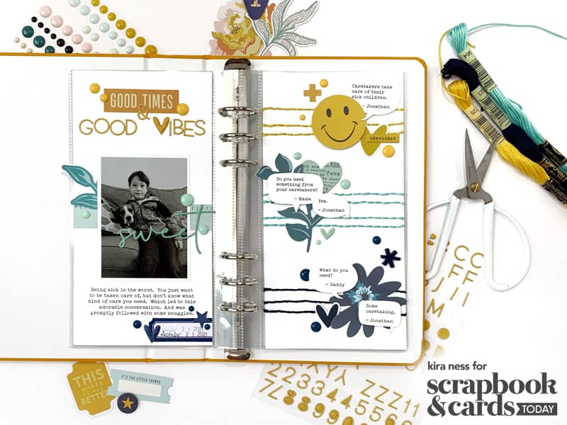
I was flipping through my pocket page cards and came across a cute 4 x 6 inch card that had two speech bubbles, one in yellow and one in aqua. I loved the colors immediately and the speech bubbles sparked a design idea for my page. It is not uncommon for me to type up notes of conversations I have with my kids, so I found a story that I typed up in speech bubbles. These speech bubbles served the dual purpose of journaling AND embellishment.

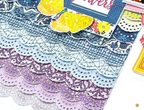
Since I knew I wanted to focus on color for this layout, I thought the easiest way to do that would be color-blocking. This is a technique where you take 2-3 colors, usually complimentary, but there are no set rules about this, and then layering similar embellishments on or near the same colors. I wanted to use yellow and aqua (like my pocket card) and thought navy would work as the perfect neutral.
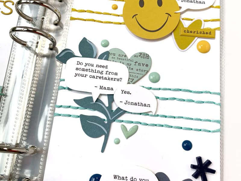
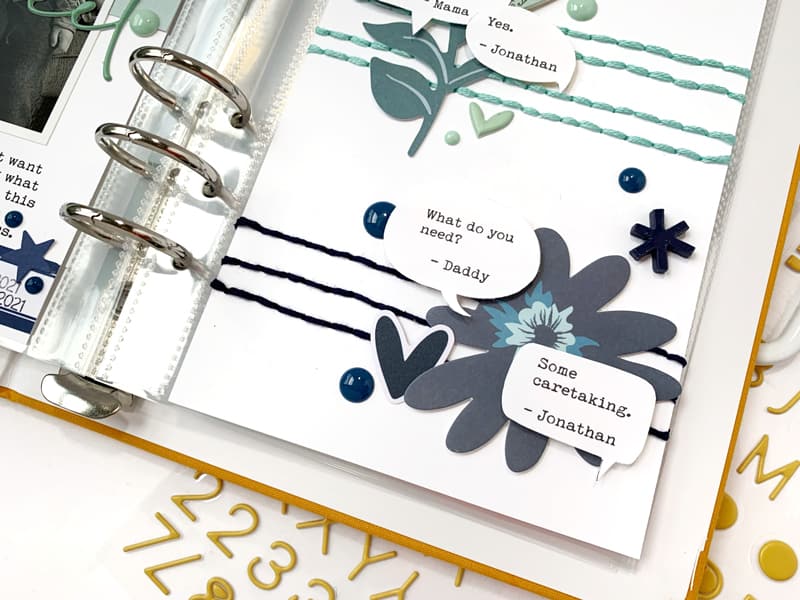
I started by stitching lines across my page using embroidery floss; yellow at the top, followed by aqua, and then navy at the bottom. My die cut embellishments are organized in my stash by color, so I sifted through my die cuts and found a few in each color I thought might work for the page. Then, I layered the die cuts around each of my speech bubbles, color matching each of the stitched lines.
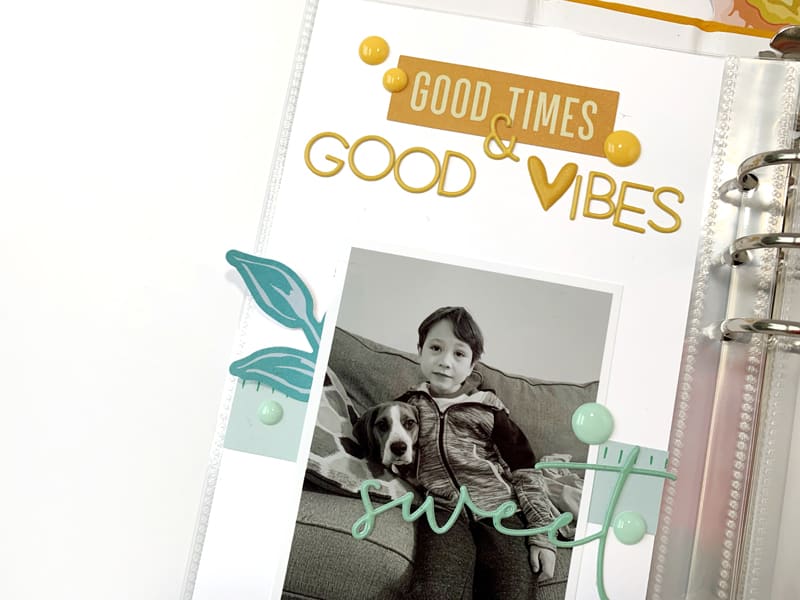
On the opposite page, I kept to the same design principle and layered my embellishments by color. My title at the top of the page is in yellow. Around the photo, I kept aqua embellishments. The label with my date at the bottom is in navy.

Along with my paper die cuts, I also wanted to add other interesting textures to the pages. I brought in puffy stickers and enamel dots and color-matched those to my pages as well.
Watch me create this spread in my process video, and get a lesson on this easy-to-use design technique:
Thank you so much for joining me today! I can’t wait to see how you use this simple and effective design technique on your future projects!

I’m Kira Ness, a Pacific Northwest native living her best life in sunny San Antonio, TX. I tend to jump into things feet first, so when a friend suggested I start scrapbooking in 2017, I was immediately all in. And although my style has shifted and changed over the years, scrapbooking has remained my most beloved hobby. When I am not in my craft room, you can find me planning parties or adventures for my husband and two boys. You can get to know me a little bit better on Instagram feed, @kira.gets.crafty!
I love these pages. Such a fun idea for keeping this memory. Love the stitching and the color blocking.
Super cute and love the speech bubbles!
This is so gorgeous! Always forget about colour blocking ideas. <3
Beautiful. I love the format.