
Welcome to another week of inspiration and insight, and we are kicking it off in a big way with our June Designer Details post! Today we have the wonderfully talented Emilie Chamel to teach us and inspire us, and today her post is all about adding texture and volume to your pages to make them stand out and be truly unique! Let’s get some tips from Emilie today!
…………………….
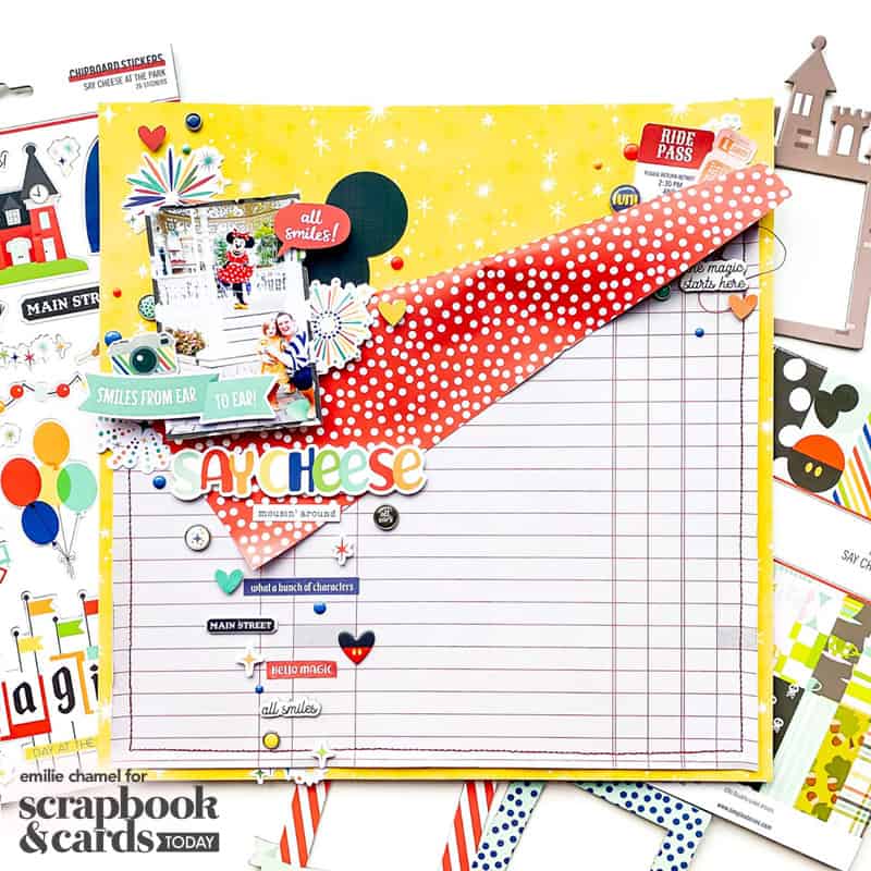
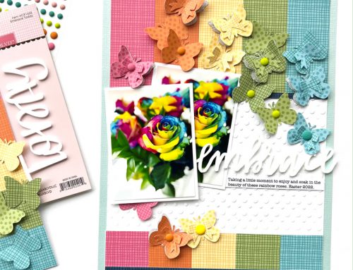
Hello friends! My name is Emilie and I am so honoured and excited to share this layout with all the Scrapbook & Cards Today readers. For this layout, I have used the brand new Say Cheese a the Park collection by Simple Stories alongside a lot of techniques on how to add texture. Let me show you how!
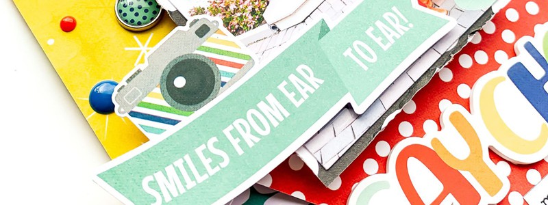
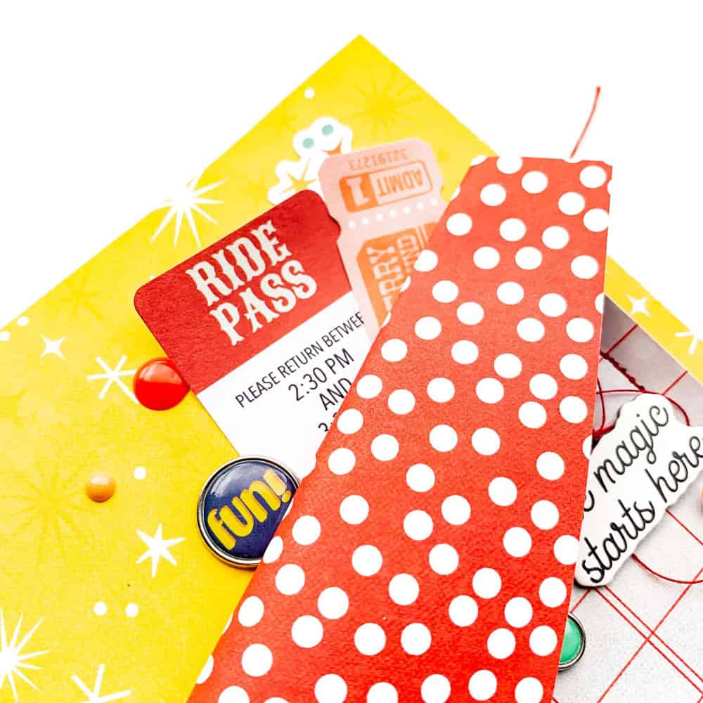
Supplies | Simple Stories Say Cheese at the Park collection: Meet Me on Main patterned paper; Full of Wonder patterned paper; cardstock stickers; 6×8 patterned paper pad, 6×12 chipboards, Bits and Pieces, Sticker pad, foam stickers, puffy stickers, decorative brads, enamel dots
My eye seems to be attracted to everything that adds detail and dimension to a page and there are so many ways to do that.
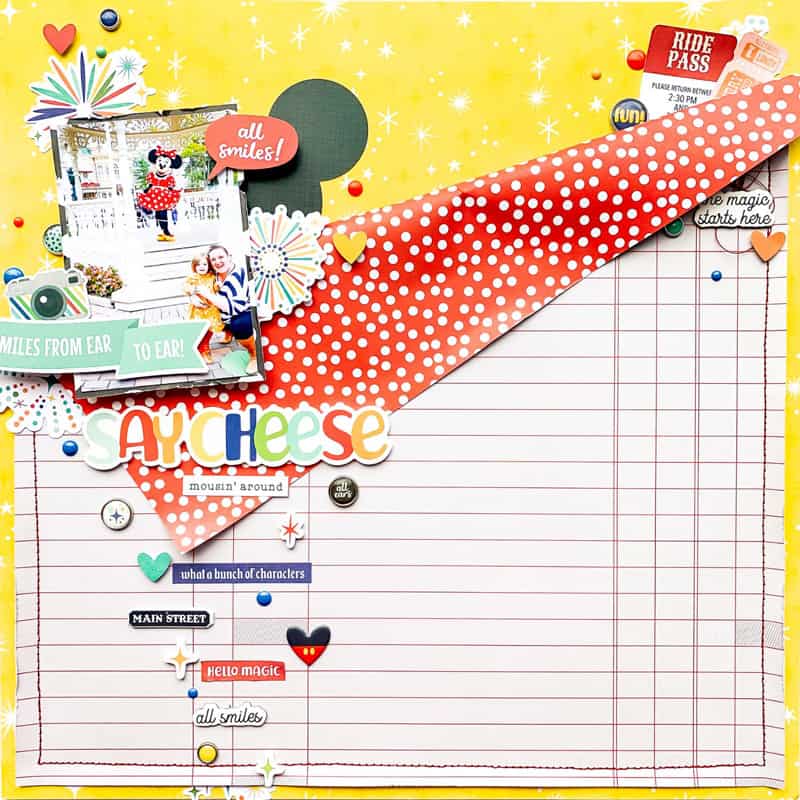
My first stop when looking to add texture is to use stitching. It can be machine stitching, by hand, or even false stitching (line drawn by hand or with stamps, just add a tiny poked hole for an even more realistic effect): a stitched line immediately adds texture and detail. It makes a layout seem more “finished” somehow. This is why here it was my start point. After deciding where I would fold the top part of my patterned paper I went on to machine stitch alongside the three remaining edges.
Another way to add texture to your projects is by distressing the edges. The great thing with this technique is that you can be as light or as heavy-handed as you wish to be! Here I remained light-handed, slightly rubbing my scissor alongside the edges of my top patterned paper after it had been stitched. I was a little bit heavier on the patterned paper on which I mounted my photograph as these get a little bit more lost due to the flurry of activity that usually tends to happen around my photos.
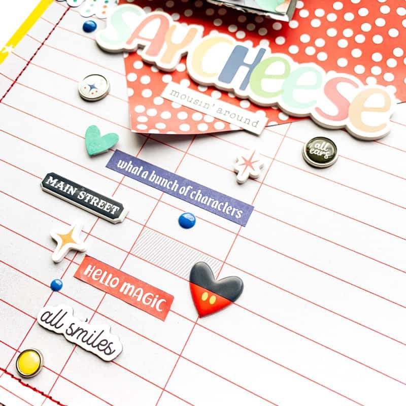
Mix and matching your supplies is the easiest and yet a very effective way to bring some texture to the page. Nowadays, collections are full of epoxy dots, foam stickers, chipboard, puffy stickers, and so on. I took full advantage of it here by deliberately mixing all these embellishments. Flat, raised, shiny, domes, matte… there is now a trail of different effects running down the left-hand side of my page with a minimum effort!
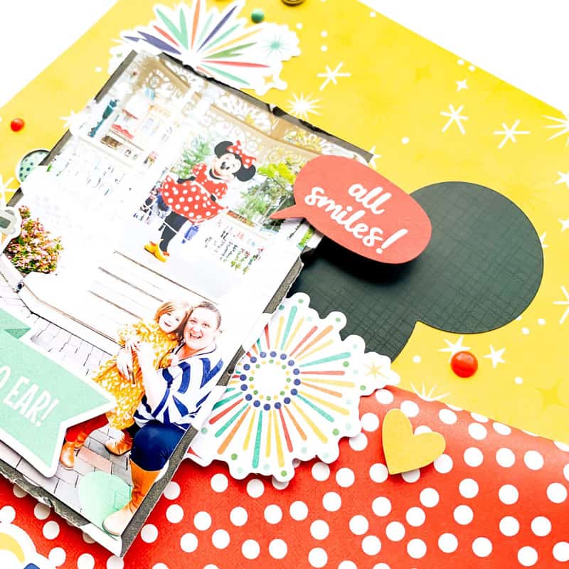
And last but not least, my favourite: volume! Volume adds so much texture to a page! The top patterned paper, just by the fact that it is folded, adds tones of drama and texture. I have then raised and layered my photo and embellishments by using a lot of sticky foam pads. These help to secure everything in place at the height I wish it all to be. They are my absolute must-haves!
Watch as I create this layout, adding lots of texture and volume along the way!
Would you have believed that we could have four different techniques to add texture on one single layout without looking overwhelming or even disjointed? I think this is where the key to making it work comes in: create your layout as if you were creating a special dish. A small pinch of each ingredient is more effective than too much of everything. A good food analogy! On that note, I hope that you enjoyed those few tips today and that I inspired you to try to add a little bit more texture to your pages!

Emilie Chamel is a passionate scrapbooker who is currently on several design teams such as Simple Stories, Pinkfresh Studio and Bella BLVD. She started scrapbooking back in 2006 and hasn’t looked back since. She loves creating layouts about her daughter and inspiring fellow crafters. You can find her on Instagram and YouTube.
Beautiful
This is such a happy, magical layout! That little Mickey heart puffy sticker is so cute I can barely handle it. ????
So much texture and movement across the page. Nice design.