
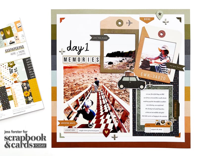
Hi friends! It’s Jess Forster here and I am back to share how I coordinate my pocket pages with traditional layouts. You may remember that back in May, I create this cute travel 12 x 12-inch layout of our 2019 trip to Prince Edward Island.
Check out Part 1 of this blog & video series HERE!
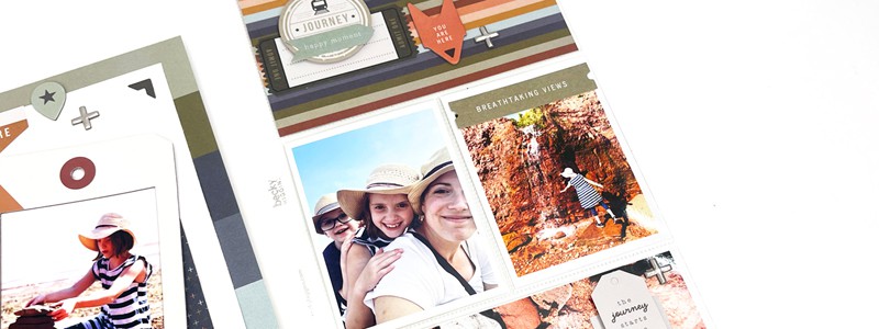
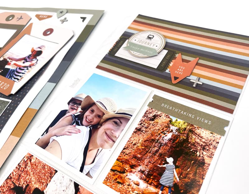
Today, in part two, I am sharing a process video of how I put together a single 6 x 12-inch pocket page for Canada’s east coast. Since I had so many great photos from our first day driving around the south part of Prince Edward Island and visiting Argyle Provincial Park, I decided to add a coordinating pocket page using the beautiful bold designs of the Simple Stories Here + There collection. Have a look:
Supplies: Simple Stories Here + There Collection; Project Life: Design H pocket page; American Crafts: Sorbet Thickers, Scrapbook Adhesives by 3L: Adhesive; Font: Georgia Italic
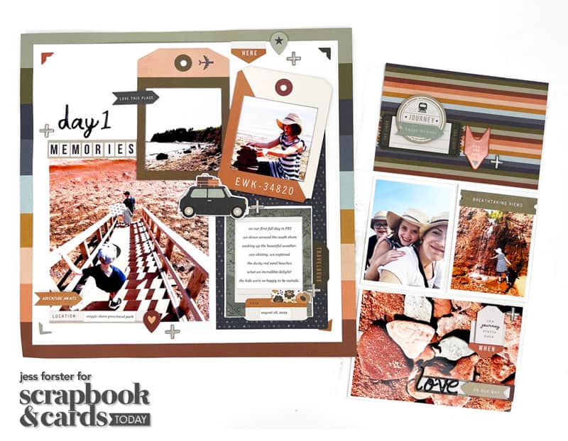
I used the rainbow “Travel Therapy“ paper or the background of my traditional 12 x 12 layout as a guide to coordinate the colour scheme for my pocket page. One way to connect a pocket and traditional layout so they look cohesive is by using the same products and colours on both. I selected the rainbow stripe paper from the 6 x 8-inch paper pad and journaling tags including arrows from the Simple Stories Here and There collection to bring the same elements + motifs to my pocket.
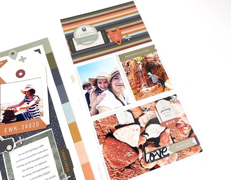
Using a Design H pocket page, I printed out three extra photos: two 3 x 4-inch pictures and one 4 x 6-inch photo. I created a 4 x 6 filler pocket and embellished the paper and lower 4 x 6 photo to create a visual triangle across the pocket page and traditional layout.
Take a look at this video to see how this pocket page came together:
Pocket pages are a great way to add extra travel photos to your albums. I hope this post inspires you to add coordinating pockets to your traditional pages. Safe travels and happy summer!


Beautiful pages!
I love that you are scrapping PEI. Don’t often see pics from here being used. Come back again soon! The pages are lovely.
Really cool layout.