
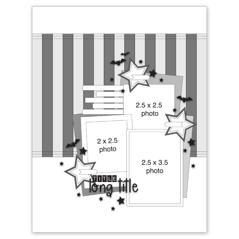
Hi everyone! It’s SCT sketch artist Allison here today to share three layouts that all use one of the sketches from the fall issue as the inspiration. I always see sketches as simply a starting point that you can build on with your own creative ideas. Maybe you follow the sketch exactly, maybe you make a few changes to better suit your needs, or maybe you take one element and infuse your own unique style for a layout that doesn’t even end up looking like the sketch. There is no right or wrong way to use a sketch!Today, I decided to use one of the 8-1/2 x 11” sketches and adapt it to work with 12 x 12” layouts. I always say never let the size of the sketch determine the size of your layout. I love the challenge of taking one size of sketch and adapting it to work for a different size of layout. A lot of times it makes me think outside of the box and I end up with designs that I might not have ever thought of. There are always ways to stretch, extend, shrink, or enlarge to make things work on different sizes of layouts.
Click HERE to see all of the sketches from the fall issue!
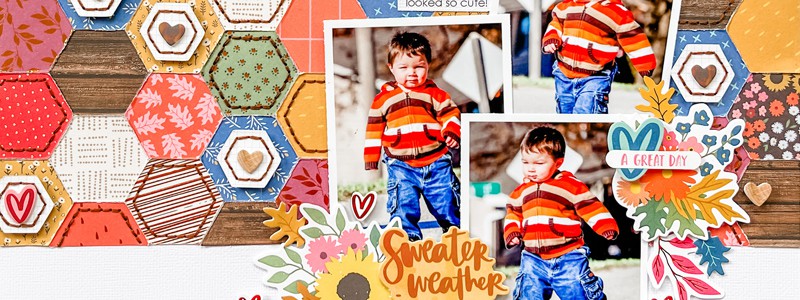
Supplies | Cardstock: American Crafts; Patterned paper: Amy Tangerine for American Crafts, Simple Stories; Hexagon punches: Fiskars; Foam stickers: Amy Tangerine for American Crafts; Stickers: Amy Tangerine for American Crafts; Embroidery floss: DMC; Font: Century Gothic
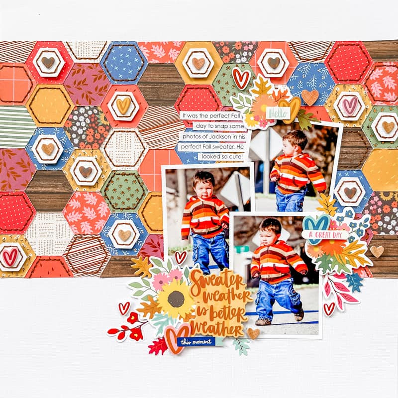
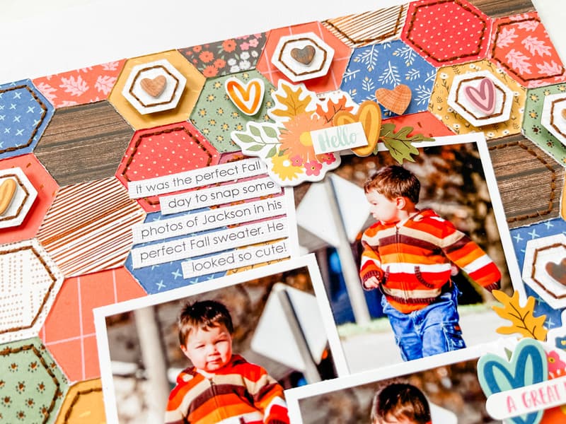
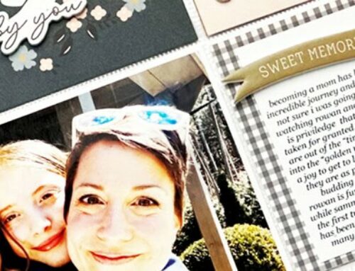
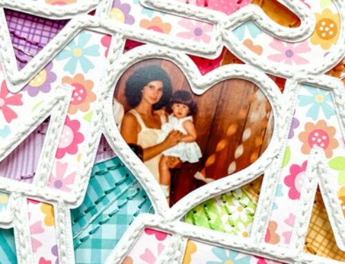
Anytime I see a large background area on a sketch, like the grouping of vertical strips on the sketch above, I always consider different ways I can take that whole grouping and recreate it with different shapes to better fit my photos, theme, or ideas I might have. For this layout, I loved the idea of pairing hexagons with my Fall theme. So, instead of vertical strips, I used hexagons grouped together to create a background that is close to the same size as the vertical strip background on the sketch. I always love lots of texture and dimension on my layouts so I added some hand-stitched detail to a few hexagons and a few smaller hexagons popped up with foam adhesive.
When it came to the photos, I had three 2-1/2 x 3-1/2” photos which is a little different from what you see on the sketch, but I was able to arrange them in the same placement.
For the rest of the layout, I followed the same placements for the title, embellishments, and journaling strips as you see on the sketch.
Supplies | Patterned paper and die cut pieces: Vicki Boutin for American Crafts; Cardstock: American Crafts; Wooden Hearts: Jillibean Soup, Studio Calico; Acrylic title piece: Color Cast Designs; Word/phrase stickers: Simple Stories; Embroidery floss: DMC; Font: Century Gothic
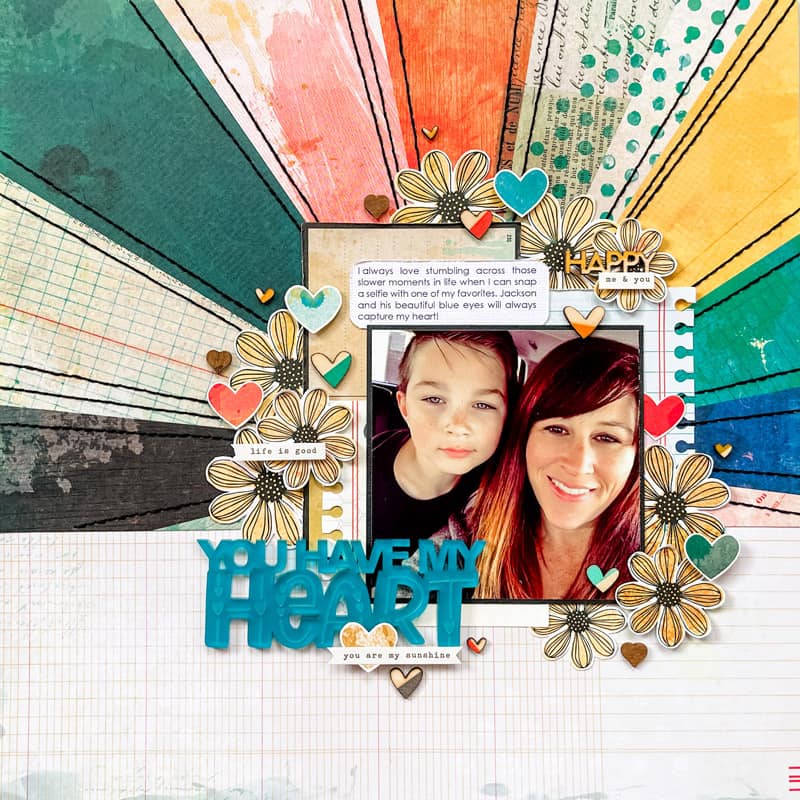
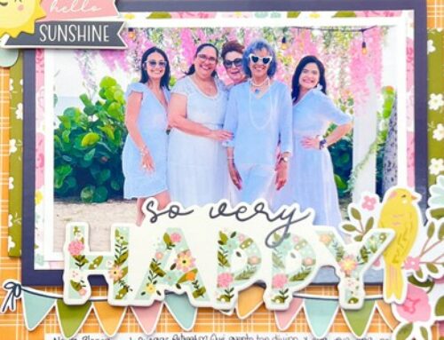
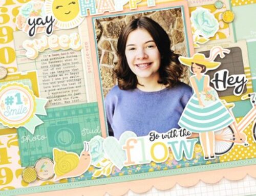
With my second layout, I simplified the background by using a single piece of patterned paper in place of all those strips. I chose to use a patterned paper with a sunburst design so I still have a lot of interest, color, and detail with that background, but without the work of cutting all those strips. Using a striped paper would also be a great idea for simplifying this sketch design!
I only had one photo to work with so I made a few adjustments to accommodate that. I added three die-cut pieces layered behind the photo and then tried to arrange my flowers closely to how the stars are arranged on the sketch. It’s not quite the same, but it’s close! When using a sketch you often have to make small adjustments like that to better fit your photo or other changes you have made. Don’t be afraid to change it up!
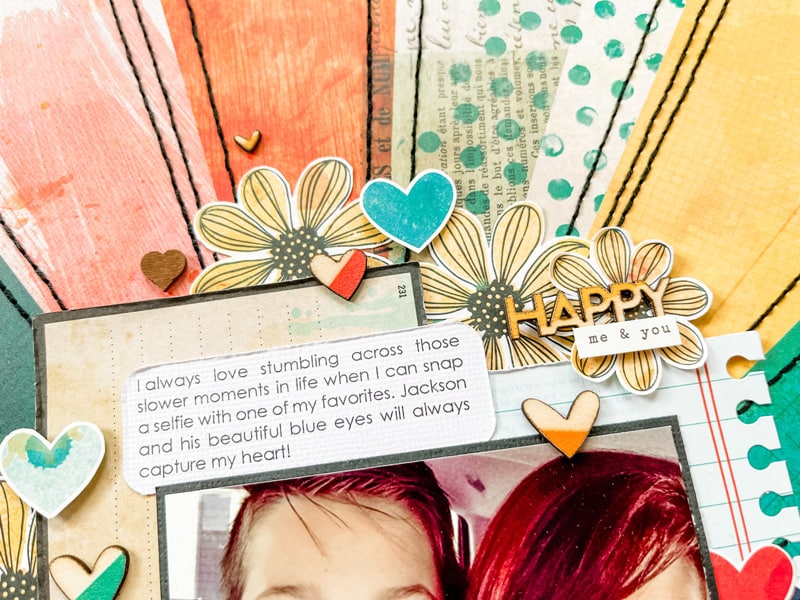
Whenever I am creating embellishment clusters I like having lots of variety and detail so I added hearts and word and phrase stickers in with the flowers.
Supplies | Cardstock: American Crafts; Patterned paper, foam stickers, stickers: Simple Stories; Wooden pieces: Jillibean Soup; Embroidery floss: DMC; Font: Century Gothic
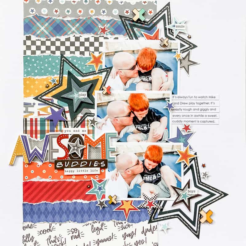
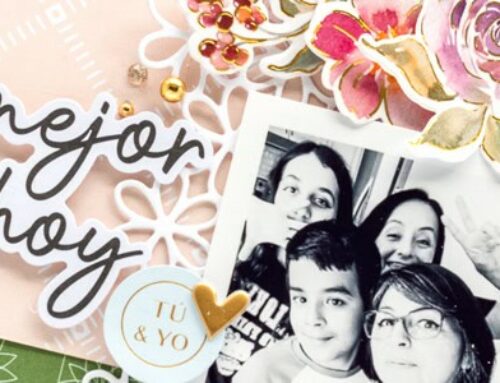
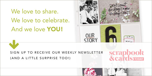
With my third layout, I made some bigger changes! I had three 3-1/2 x 2-1/2” photos that I wanted to use so I made a few adjustments to both the photo arrangement and the strip background design. I rotated the vertical strip background to create horizontal strips instead and then kept the photo arrangement and embellishment cluster as close as possible to what they were on the sketch. It was a big photo change so it’s not quite the same, but this was my way of making it work. With the strips rotated you could see more of the patterned papers with the photo arrangement the way it is. Rotating the sketch is always a great (and fun) way to get a completely different look out of a sketch!
For those background strips, I used torn strips instead of the straight 1/2” strips. I thought this added a fun, rough look to my boy-themed layout.
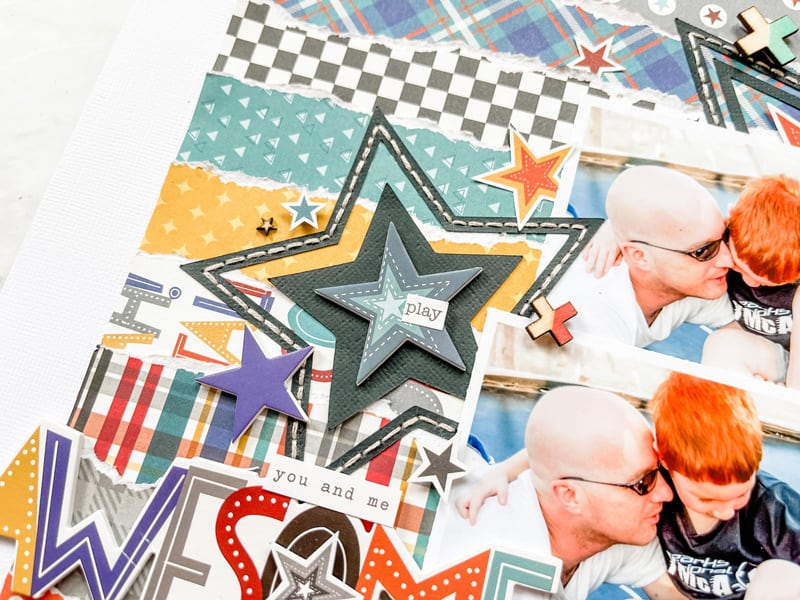
I tried to mimic the photo and embellishment design while adapting it to fit my ideas. I added some large stars in place of those pieces behind the photos and then added lots of smaller stars around the whole grouping.
With these three layouts, you can see that there are several ways you can take a sketch of any size and make it work for a different size of layout. Two-page sketches can become one-page layouts and 12 x 12” sketches can work for 8-1/2 x 11” layouts or vice versa. You can even do this with card sketches! Just remember, sketches are not a rule that has to be followed. They are simply a starting point that you can use to build on your own creative ideas and style.
My challenge to you is to use this sketch (or any of the sketches in the fall issue) and see what unique ideas you can come up with. If you do use this sketch I would love to see what you create as well so if you are on Instagram be sure to tag me, @allisondavis4sg and @sctmagazine! Thanks for stopping by the SCT blog today!
Hi, I’m Allison and I’ve been scrapbooking for about 17 years. I got my start when my family decided to open a scrapbook store in Springfield, MO called Scrapbook Generation. A few years after we opened the store I started creating sketches and producing monthly sketch bundles and books while teaching and sharing how to adjust and customize sketches through my website, online classes, and YouTube channel. I have been married to my husband, Mike, for almost 19 years and we have two sons, Drew and Jackson. Drew is continuing the “generation” element of SG as the third generation working at our store. It truly is a family business!
Find more of Allison’s work here: Website | Sketches | Facebook | Instagram
I always enjoy seeing Allison’s multiple takes on a single sketch! Every once in a while, I play with a sketch multiple times too. All of these layouts are so great!
Fabulous layouts!
These are great takes on the sketch! Always fun to see how different ideas come from the same inspiration.
Great takes on this sketch and I am so literal and would not have thought of them. Really inspirational!! Love the tearing layout the best for me, because it isn’t as technical and I could use leftover papers! So much to love!