
Hi friends! It’s Jess Forster here, and I am excited to share with you one of my favourite ways to design a pocket page: through clustering or blocking like items together! Have a look:
Supplies | Pocket Cards, tags, embellishments: Elle’s Studio; Adhesive: Scrapbook Adhesives by 3L Foam Squares; Georgia Italic Font
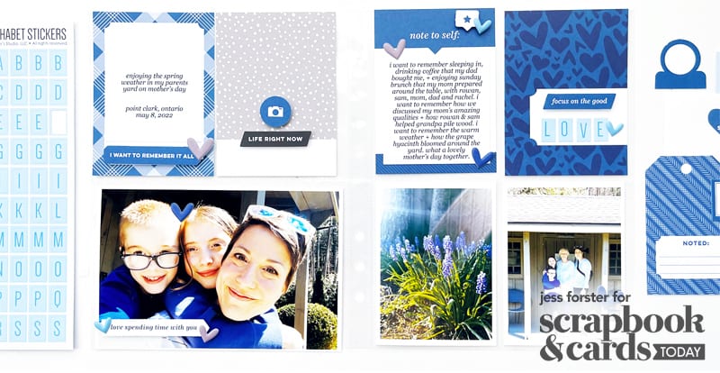
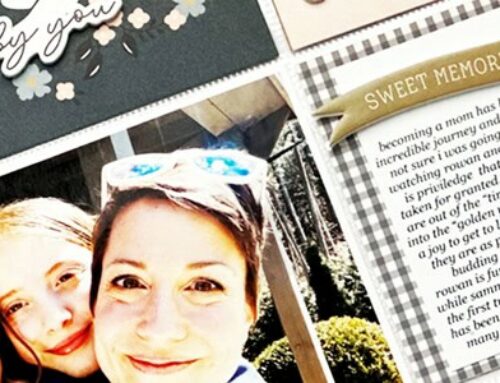
In this double 6 x 8-inch pocket page which documents Mother’s Day 2022, there are three ways that I cluster like items together: photos, pocket page cards and embellishments.
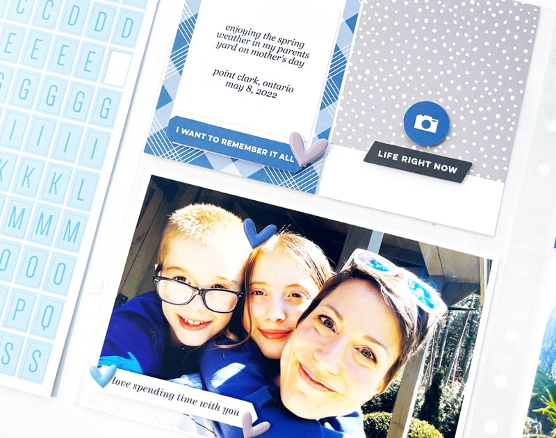
One way I like to cluster my photos and pocket cards is to have a definitive divide between the items. On my Mother’s Day page, I grouped my photos, which included one 4 x 6-inch landscape and two 2 x 3-inch portrait photos horizontally on the bottom of my page, based on the openings of my pocket page.
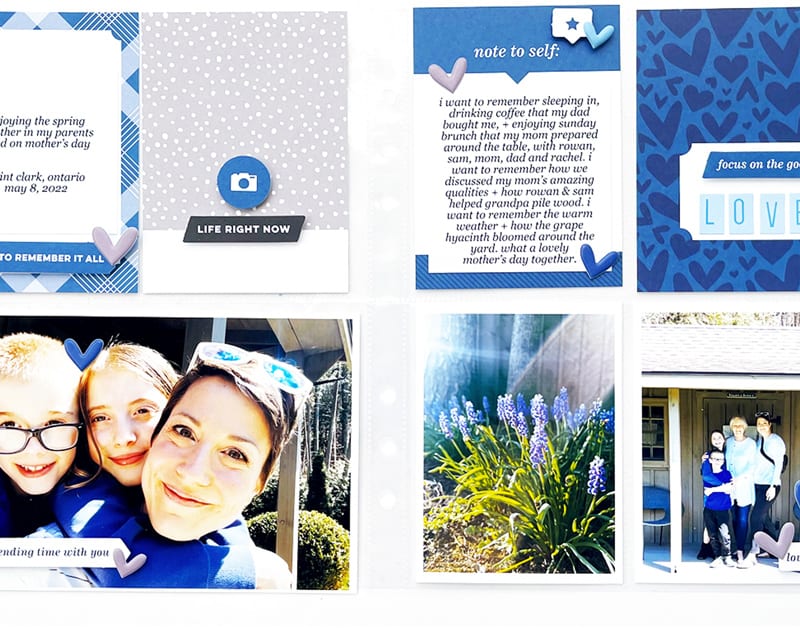
With the pictures in place, I then selected four 3 x 4-inch pocket cards from the February 2022 kit from Elle’s Studio, and placed them on horizontally on top. As you can see, there are two distinct areas with in my layout.
Given that this is an asymmetrical page, meaning there is more visual weight on the bottom with the 4 x 6-inch landscape photo on the left side, I placed the a triangle of embellishments—cute tags, sayings and puffy hearts leading to the top right hand “note to self” pocket card. This helps to direct the viewer’s eye around the page as well as balances out the visual weight.

Do you cluster like items together on your pocket pages? If so, please share with us in the comments what items you like to block together. I would love to hear how you approach pocket page design currently!

I hope you enjoyed today’s inspiration and if you haven’t tried out these simple design tips, give them a try! Happy crafting!
This us absolutely gorgeous. The colour scheme is fantastic. I would not have thought of that.
I love all the packet page tips and tricks you share, Jess! It’s very helpful to this newbie. Thank you :)
Those blues together make a stunning layout!
I’ve really gotten into pocket-page scrapbooking these last couple years, but have been having trouble making them feel like a cohesive ‘layout.’ Thanks for sharing this – it’s helped me see how I can apply some of the same techniques I used on 12×12 pages to designing pocket pages! (LOVE the blue theme, BTW.)
Such a perfect balance of photo, journaling and embellishments!
Jess Forster is such a down-to-earth personality and I love her simple methods of creating and completing wonderous projects! :)